

Recent Posts

The Best Google Business Tools
Nov, 2022

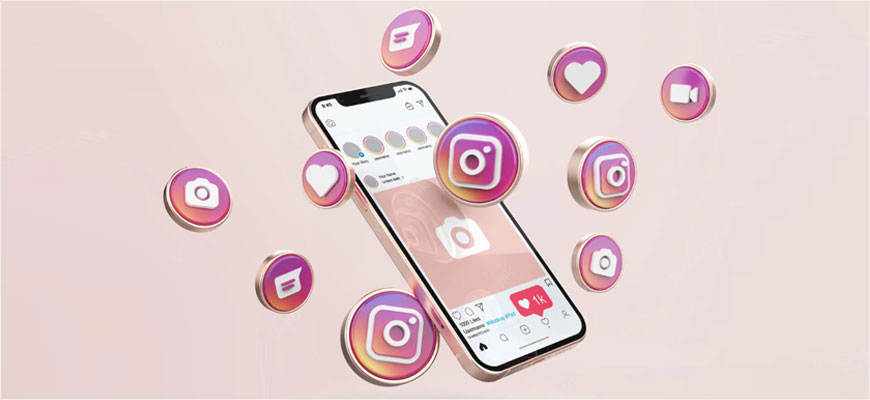
New Instagram algorithm 2022
Oct, 2022
What is affiliate blogging?
Aug, 2022


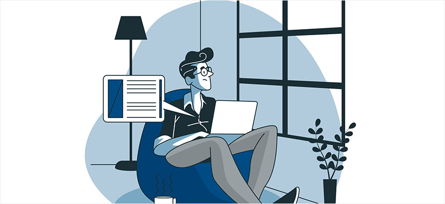
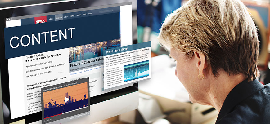
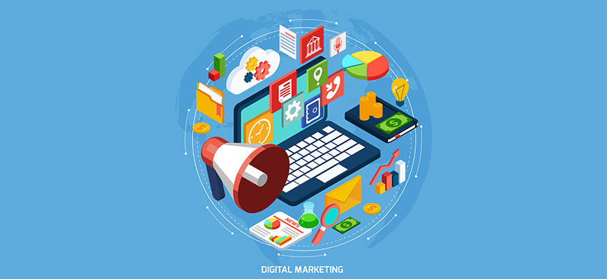
Content Marketing Ideas
Apr, 2022
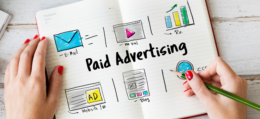
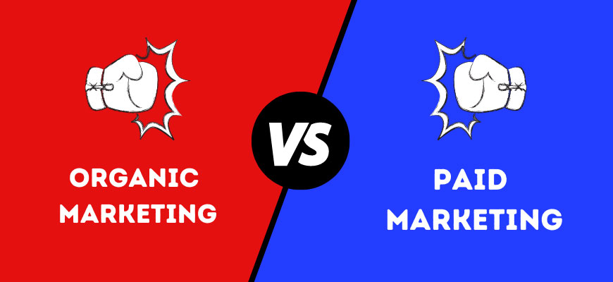
Reasons for paid marketing strategy
Apr, 2022
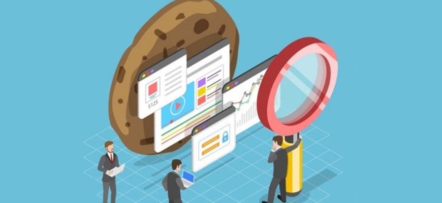
First-party Cookies
Mar, 2022

Visual Search and its Overview
Mar, 2022
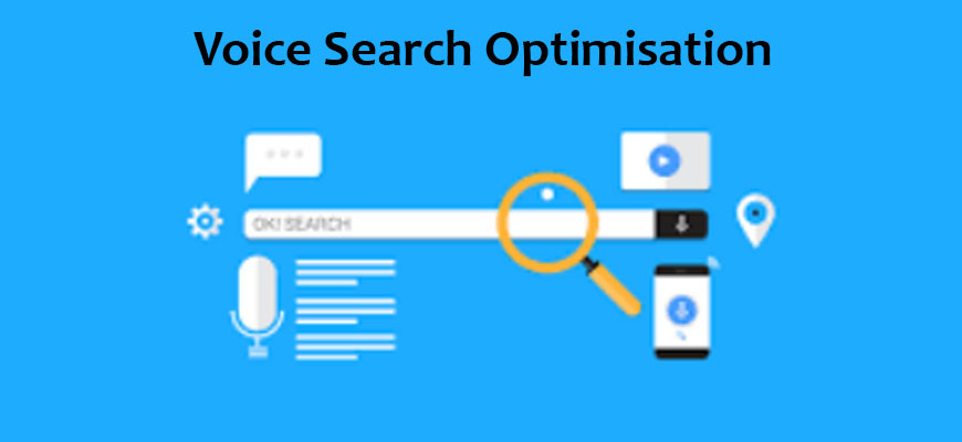
Voice Search Optimization
Feb, 2022

All about E-commerce Management
Jan, 2022

Content Marketing In 2022
Jan, 2022
All about E-commerce Management
Jan, 2022
Content Marketing In 2022
Jan, 2022

Benefits of Social Media Marketing
Nov, 2021
How to Build a Media Buying Strategy
Oct, 2021


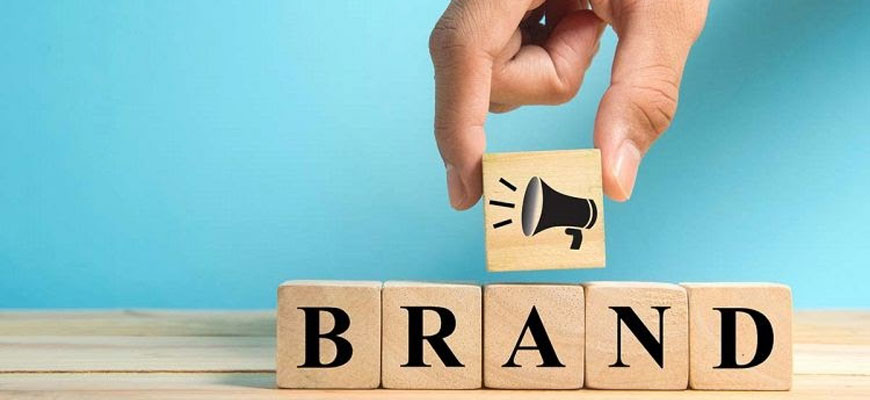
5 simple ways to improve brand awareness
Jul, 2021
How To Write Emails That Convert?
Mar, 2021

Data Mining VS Data Analysis
Mar, 2021

Best B2B Email Marketing Examples
Feb, 2021


How & Why Should You Help iSN Help You?
Jan, 2021
Performance Marketing Solutions For SaaS
Jan, 2021


By Omkar Waghmare | May 2022
Introduction
Designing an effective banner campaign can be a time-consuming and complex process that involves many people. Because of time restrictions, sometimes it is easy to forget some steps or disregard particular aspects of banner design. Fortunately, it will no longer be a headache anymore. We have designed these guidelines to help you with your creative banner design. Follow these pointers to work as efficiently as possible, and get everything covered.
Here are a few pointers to help you:
- To increase market presence, it is prominent to highlight your company's logo but not as much as the value proposition and call to action.
- The value proposition is a unique selling point, and it should highlight the service/product you offer and draw attention to itself with appealing offers and prices. Consider phrases like '50% discount' or 'limited time deal'. It should take up most of the space in your advertisement and grab the reader’s attention.
- Keep the information and aesthetics as minimal as possible. Viewers will not pay attention to your ads for more than 5 seconds. Visitors should get the message you want to convey by that point.
- Depending on the content of your banner, buttons may frequently boost your ad's click-through rate (CTR). If you want to utilize them, put them after your copy on the lower right side in (subtly) contrasting colors. Maintain this consistency throughout the ad campaign.
- Change the size of your headline and body content. Every piece of content must be four lines or fewer.
- Use cursive/script fonts, extremely thin font weights, all capital material, or font sizes less than 10 pt unless it's a disclaimer or copyright notice.
- To give the text a sense of visual urgency, use contrasting, vibrant colors. Advertisements on banners are not necessarily meant to be inconspicuous.
- Keep in mind that integrating visuals in your banner advertising isn't always necessary. Killer writing and gorgeous typography may both have the same impact.
-
Select the relevant colors.
Colors have different cultural implications and are thus subjective. When choosing colors, keep your target audience in mind. Below is a list of colors and the emotions they often generate in a Western audience.
- Red represents passion, rage, excitement, and love.
- Orange represents playfulness and energizing feelings.
- Yellow represents happiness, brightness, and friendship.
- Green represents health, vitality, the environment, progress, and nurturing.
- Blue represents security, trust, purity, calm, intelligence, refreshment, and coolness.
- Purple represents luxury, grandeur, extravagance, knowledge, and magic.
- Pink is associated with love, tenderness, femininity, youth, and infants.
- Purity, cleanliness, modernism, sterility, simplicity, honesty, and innocence are all associated with white. White evokes ideas of prosperity and youth.
- Brown is associated with nature, wood, seriousness, masculinity, and roughness.
Conclusion
That's all there is to it! These are only some banner ad design principles; creating genuinely outstanding, high-performing advertising requires much more. If you're not a skilled designer (or too busy operating a business), consider hiring a brilliant creative to create the perfect, clickable advertising for you.